Every Canucks Jersey Ranked
- Kyle Welsford
- Mar 14, 2022
- 5 min read
Updated: Feb 24
Before we get started I just want to say that you are very welcome to disagree with me as the look of a jersey is truly subjective... beauty is in the eye of the beholder. The sheer variety of jerseys the Canucks have worn in their 50+ years has been astonishing, thus your ranking and this ranking may be different. Your least favourite jersey could be my favourite... who knows!
That being said if you disagree with a single one of my rankings just know you are wrong :)
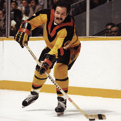
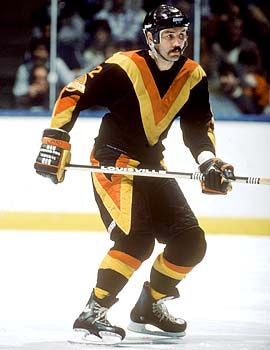
12. THE HEINOUS SKATE
(1985 - 1989)
"How can you put a skate jersey as your least favourite jersey in the franchise?"
That's probably what you said...
The reality is these jerseys are bad, really bad. Let's first focus on the disgusting yellow one. The logo gets drowned out by a sea of yellow, YOU CAN'T SEE ONE OF IF NOT THE GREATEST LOGOS IN SPORTS HISTORY ON YOUR OWN HOME JERSEY! The lack of black on them is disturbing, to say the least. Speaking of black, these black skate jerseys while not as unforgivable as the yellows feel out of proportion. Like a fourth-graders attempt to re-create the iconic 90's black skate in NHL create a team. While better times were to come to the Canucks wardrobe, these are truly heinous and are nuckstalk's worst jerseys in franchise history.


11. REVERSE RETRO
2021
Thank goodness there were no fans in the stands when these jerseys were rushed out by Adidas due to Covid revenue loss. This is nothing more than a filthy attempt to capitalize on the nostalgic and beloved red gradient jerseys from the mid 2000's. Are these the second worst-looking jerseys in franchise history, perhaps not, but these without a doubt are the most heart and soulless. They could have done anything with these jerseys, (some teams like the Rangers, Flames, and Blues got amazing ones) but instead they gave us these... hey at least it's better than losing the draft lottery again!


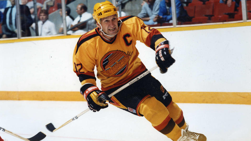
10. FLYING L
1978 - 1985
Look I'll be honest I have a real soft spot for these jerseys. They were amongst my favourite jerseys growing up. Maybe it was because everyone else hated them so I felt the need to be a contrarian. To this day the black V's are among my favourite jerseys in sport, period, but unfortunately, they made the yellows. Look when the Canucks wore the yellow V's in the warmup I was happy, but it was at that moment I realized they are only possible to take in small doses. THEY WORE THEM FOR 7 SEASONS. That's 280 games... If I had to look at the yellows for 7 years I may not be a fan of the Canucks


9. THIS IS A JERSEY
2008-2017
No, this jersey is not the same as the original... the logo is fundamentally different. Carry on
When the Canucks changed the colour of their jerseys in 2008 many fans were eagerly wondering what their 3rd jerseys would look like. Well, Canucks fans ESSENTIALLY got the same jersey as the current home at the time. Sure they slapped on a weird slightly modified version of the stick and rink. Johnny Canuck on the shoulders while NOT VISABLE from the TV is a nice touch. These just felt so corporate. Not terrible jerseys but forgettable to say the least.


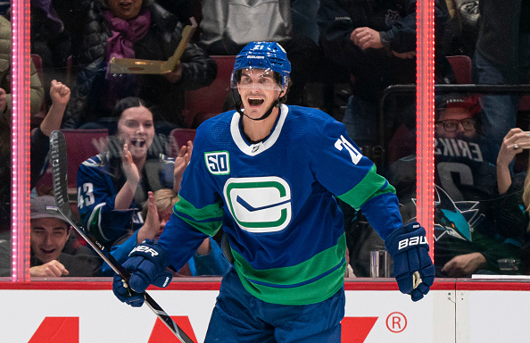
8. COLOUR RUSH
2019 - Present
Well, Johnny Canuck still isn't on the front of the Jersey, in fact, he is nowhere to be seen. When these first came out I was appalled. SO MUCH GREEN AND BLUE! However, over the last 3 years, these jerseys have grown on me. I look at them akin to the "Colour Rush" uniforms worn by NFL teams every Thursday. They are nice once in a while... decent 3rd jersey


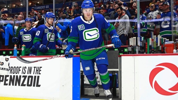
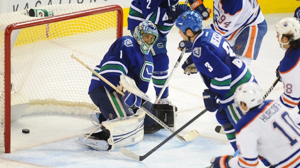
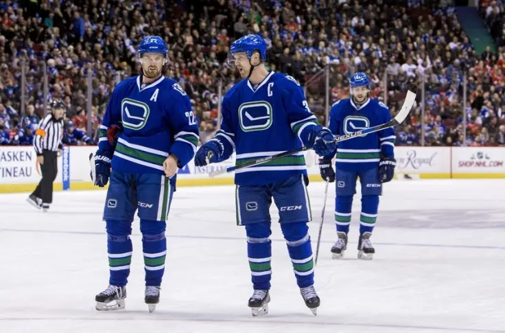
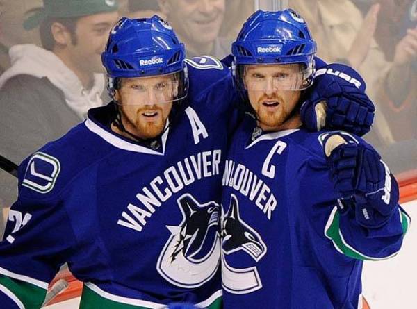
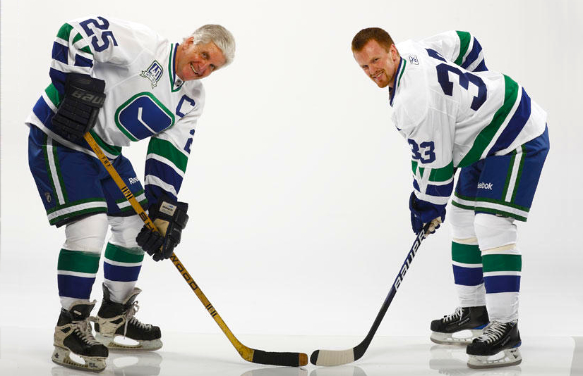
7. CURRENT JERSEYS
2007 - Present
Much like the 08-17 third jersey, these jerseys are safe and friendly. Yes, the blue, green, and white trim are nice. Yes, they rostered the best team in franchise history while wearing these. Yes, they were one game away from winning it all... pain. Unfortunately, they are neither unique nor classic. Somewhere stuck in between old and new.
The best way to describe these jerseys is like getting a seat to yourself on the bus... mundane yet satisfying


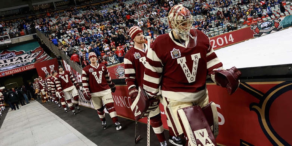
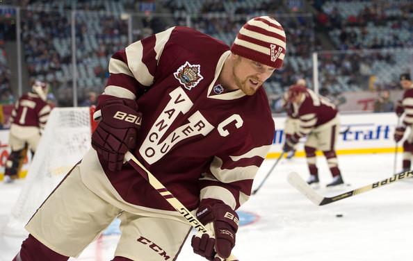
6. MILLIONARE
2013 - 2015
The Canucks played three games in these uniforms spanning three seasons, the most famous one being the Heritage Classic in 2014 at B.C place. What else can you say the burgundy and cream look fantastic as it brings shades of the 20's, the 1920's that is... (crazy to think about that). Overall, a really cool throwback and I hope they are used again if the Canucks are in another Heritage Classic


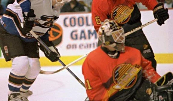
5. THE SALMON SKATE
1995 - 1997
During my ranking process, this jersey was at one point near the bottom. How did it shoot so fast up the rankings you may ask? Let us examine the purpose of this jersey.
The first important detail, it's the third jersey. The main point of the third jersey is to be distinct from the mains and to change the look on the ice a few times a year but to still work within the team's overall style. This one did that!
The second and final point being, the immaculate f***king vibes


4. THE ORIGINAL ORCA
1997 - 2007
First off,
F**k Mark Messier...
Shifting away from the skate jersey the Canucks rebranded to the orca. Taking visual cues from indigenous artist Brent Lynch (awesome) and rocking the dark navy blue which fit the "grunge" era of jerseys at the time, these sweaters are among my favourite. The blue, dark red and silver trim and the logo were all brand new for the franchise which gave the boys a distinctive look. Perhaps one of the most overlooked and underappreciated jerseys in franchise history. A modern-day classic


3. THE O.G
1970 -1978, 2006 - 2007 (third jersey), 2010 (40th anniversary)
The original.
Classic, timeless, simple, and elegant. These green, blue, and white threads not only represent hockey coming to Vancouver, my home but also paved the way for hockey to expand into the Pacific Northwest.
I also like them because the logo is a stick and rink


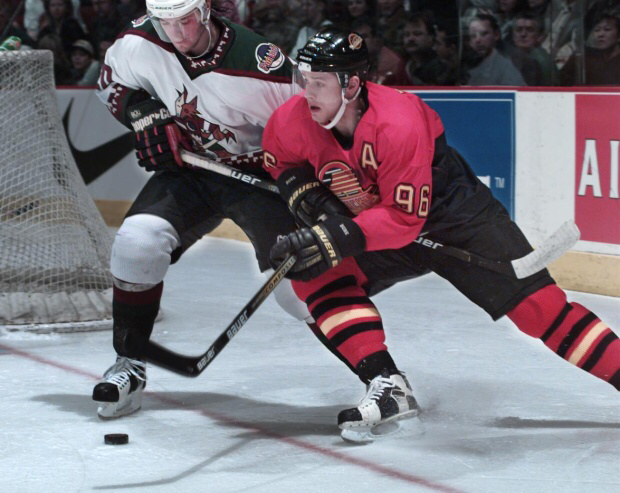
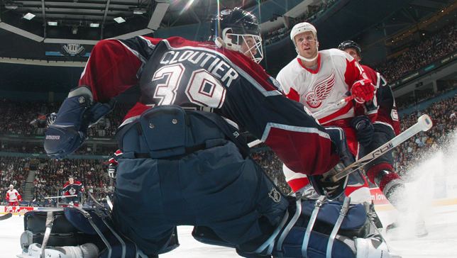
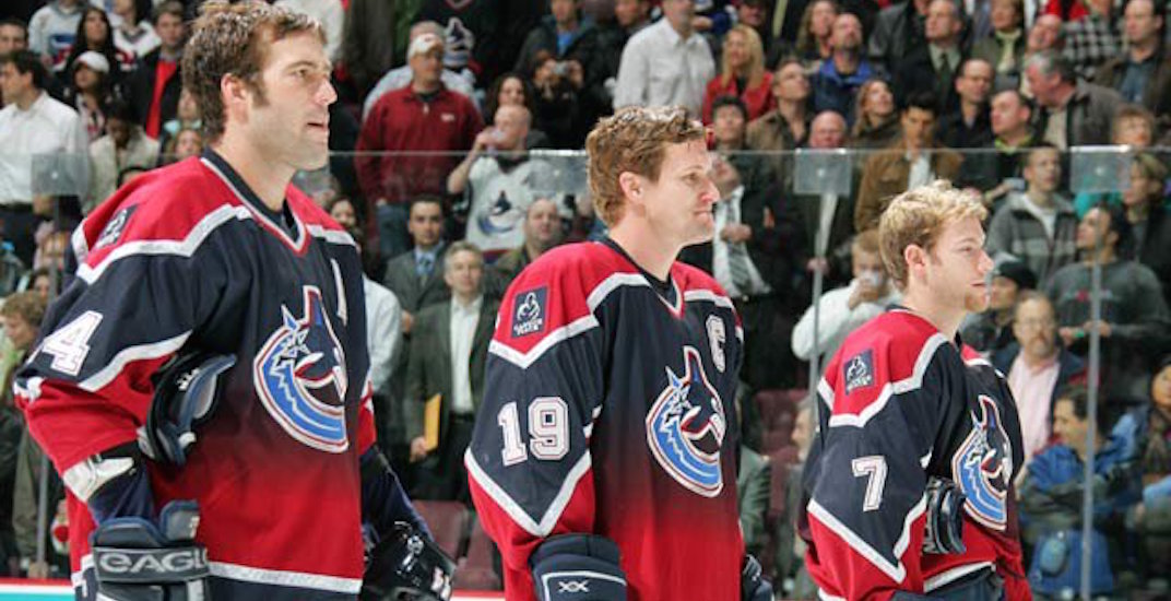
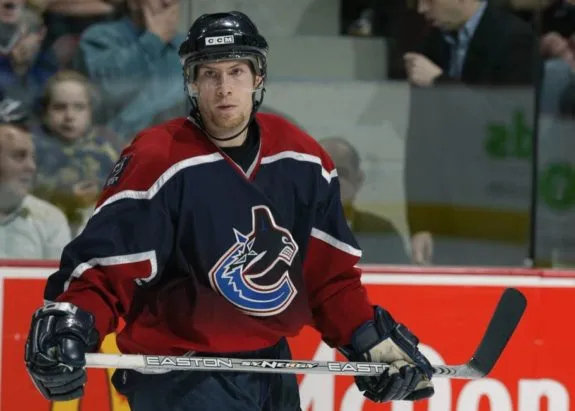
2. RED GRADIENT
2001 - 2006
These, much like the salmon skate are everything you want a third jersey to be. The gradient was an NHL first and built off the terrific orca design. The red and blue give them an aggressive yet clean look. I love this jersey for more reasons than I can count... 10/10
Sadly, this is still the only third jersey in franchise history to utilize the orca logo...
No, the disgrace that is known as the reverse retro doesn't count. That was nothing more than promotional content for Adidas (not a third)


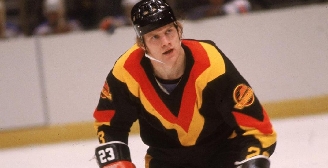
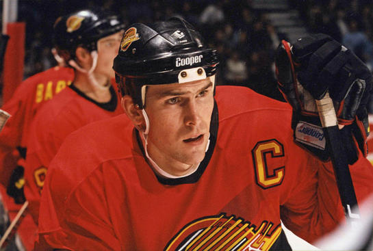
1. THE MICHEAL JORDAN OF JERSEYS
1989 -1997, 2020 (50th anniversary), 2022 (third)
As a surprise to no one, the skate jersey is the number 1 jersey on this list. It is one of the nicest jerseys in all of sport. Rare is it that you find a jersey that looks immaculate in both home and away versions.
Much like MJ, there is no doubt, there is no question, everybody must bow their head to the GOAT.


